3DCP: Beyond The Fundalmentals (Week 1)

This project was one which I at first found quite challenging. The purpose of this project was to create a temporary exhibition in the size of 20m x 30m.

I first started with doing some research on some exterior of exhibitions, and exhibition stands. I also researched some pavilions which could inspire me through their use of shapes and colours. I found it difficult at first because I didn’t know what I wanted to create a temporary exhibition for, but after a long think, I decided I wanted it design it for a fashion showcase.

After this, I started drawing up some designs that came into mind using the research that I had got as inspiration. my design consisted of abstract and curvy lines to make the building stand our more, rather than having it look plain and boring. Considering it’s only temporary I wanted it to be attractive to viewers.

This slideshow requires JavaScript.

I also experimented with a few outcomes on google sketches to grasp a better idea on what it would look like as an actual model.

This slideshow requires JavaScript.

3DCP: Individualisation (Week 2)

After experimenting a couple of designs on google sketch-up, I eventually managed to narrow it down into a more sophisticated design which included:

  • a hallway entrance
  • entrance door
  • kitchen
  • gaming room
  • toilet
  • living room
  • swimming pool/ changing room
  • 1 suite bedroom
  • 3 bedrooms
  • balcony

I then started to play about with different coloured materials to get a sense/vision of how the building would’ve ended up looking like, using materials like wood, glass and concrete which overall I think was quite successful as it looked modern and spacious just like how my client had wanted it to look like.

After this, I also started creating floors plans to help convert the measurements into scale and prepare for building my model which I did out of the material foam board.

Considering the double floors and the amount of rooms, it was a little hard for my personally to create this being it my first time but it was a project which I highly enjoyed, if not my favourite do far. It gave a real sense of what the architectural field will consist of , and it gave me the opportunity to expand on my creativity. Also allowing me to see and enhance my own capabilities and skills in order to improve.

3DCP: Individualisation (Week 1)

The purpose of this project involved working with a client and creating a product/construction according to their wants and needs e.g. a house; creating something that ideally fits their preference and taste best.

This project taught us how to work efficiently and accurately to meet our client requirements. We started of with filling in our questionnaire sheet which had questions including what we preferred over the other e.g. modern or traditional.

IMG_3762.jpeg

After this, we were randomly swapped and paired with another classmate. We then had to narrow down to 5 different tops out of the 20 that was on the sheet to focus on, and in this case, merging it to best match my skills and what I could offer best to my client as an architect.

and decided on designing her a summer house. Before meeting face to face with the client, I made a couple mood boards relating to the 5 options that I was going to focus on to present to our client. This way, our client would have a better idea of what we envision on creating for them; this also allows them to point out and voice who they like and dislike; allowing us to consume further appropriate information to apply into the outcome.

Having a small meeting with our client was very helpful as it helped to narrow down what I should and should not include within the final design for example,

I found out which type of light she preferred over the other; she didn’t like geometric shaped lamps and preferred either chandeliers or small, simple dangling light bulbs. She also had a specific preference of wood (lighter shades over dark shades), as well as the specific location that she wanted her summer house to be allocated at which was within hr motherland country, Spain. It also allowed me to ask her further questions such as, how many rooms she would prefer, and whether she preferred spacious rooms or not.

Taking these notes into account, I used the week to form more ideas in order to slowly finalise a final outcome(s). I did this by reading a few sketch ups on top of my head, and showed her a couple drafts, and slowly it developed further.

Screen Shot 2019-01-17 at 12.09.42Screen Shot 2019-01-17 at 14.09.37Screen Shot 2019-01-18 at 00.32.55Screen Shot 2019-01-18 at 00.33.02

3DCP: 3Rs (Response, Record, Remake)

In this project, we were given a random object which our tutor Geoff had gotten from the pound shop. Everyone was given a random object which related most to their pathway, and in this case considering I am an student who wants to pursue a career within Architecture, I was given a coat hanger. The aim of this project was to explore the object’s form and functions, and play about with it in order to manipulate it into something else through existing lines and shapes.

I first though about the original functions of a coat hanger and not many ideas had came to mind. I was originally quit baffled with what I could’ve created out a coat hanger, it was very unusual however as I experimented further slowly, I started to brain storm what I could potentially create by starting off with basic drawings of a coat hanger, analysing the shape and forms that its able to turn into.

To experiment further, working in 3D form, I decided to be playful by connecting the multiple sets of hangers together. Playing and rearranging the in different positions.

After doing this, I brainstormed some ideas that I was thinking of creating  as a final outcome. Including: children climbing frame, Abstract structure, Pengtagon cubed room, house, school etc.

I continued to experiment with diverse drawings using triangular shapes as an inspiration to form a structure. One design that I had designed was a school/childrens play area. This building was created to look playful and abstract to represent young children environment to play and learn. I also added tinted windows so that when there is natural light shining from the outside through the classroom windows, it gives nice lighting which would amuse the kids through the colours.

I also used the little hooks on the hangers that were given to further experiment with it. I did this by getting each ends of the coat hangers and attaching them together, and through this I was able to get the attached coat hangers to stand, creating an abstract looking construction/building. 

my first initial idea was to create a building, as it’s something that I was easily able to visualise in my mind to create a final outcome. However, I wanted to be bit more open with my options and produce something that I usually wouldn’t see myself doing so using the shape of the coat hanger (triangle), I brain stormed further ideas which eventually lead to me into creating a hanging swinging chair.

The purpose and function of this idea is for people to rest and have a little is/lay down in public when they’re tired. In a quite area throughout the whole of London. The outside is inspired by the lines of the object itself. I wanted to incorporate the abstract outcome as much as possible so I also made the outlined shape and curves using the same design. 

After experimenting with the coat hangers, changing bits here and there to see whether the height and width looked appropriate, I finalised the idea by using a hot glue gun to keep the pieces together. 

The hardest part for me was figuring out which material was going to work best in order to make the swinging chair.

Screen Shot 2019-03-07 at 00.40.52.png

I first tried using cardboard, and bending it into the direction it needed to go in but it was difficult so I decided to try a different materials. One of the materials which I had also tried and played with included silver wires. Although it was a little hard to control and make it into a clean shape, I did the best that could. After this, I used foil and wrapped it carefully around the wire to cover up the holes. 

I think the final outcome of mine was ‘good’ but definately could’ve been better and improved. I would’ve liked to create something a little more complexed rather than just being able to stick a couple of coat hangers together.


3DCP: measuring Ravensbourne (Week 2)

Continuing the project of ‘measuring ravensbourne’, we converted our final measurements using the sale of 1:20 onto our foam boards and cutting it using materials including: Stanley knife, metal ruler, scale ruler and a cutting mat.

The way that I did this was measuring the eight of the area which we were located at, and cut the height from one end of the board to the other. This is to male sure that all the heights of each pieces were the same. After this, using the measurements that I had drawn onto an A1 piece of paper, I used a scale ruler to transfer the final measurements up clearly and made sure all measurements matched up.


After cutting out all the pieces lengths of each walls, I started racing in important aspects such as the windows, doors and lifts in order to cut/score the out; this is just as important as the spacing of the model because when photographing the model we want to show the realist of real light and shadowing coming through.

Getting to the finishing my model, I found it most hard to create the roof of the model, and this is something that I should’ve made first. However, I was glad that made a few mistakes along the way as it was my first making a foam model, and it gave me the chance to learn and better my skills for next time.

3DCP: measuring Ravensbourne (Week 1)

This project was an enjoyable one – consisting of model making and designing our own functioning space. We were split into 8 different groups consisting of 3-4 people. Each group were given an area of the building on each level to measuring, using a 3m metal tape as our source of equipment – measuring corner to corner, including doors and elevators. It was important that our measurements were accurate as possible as it would affect our model making in the long run.

After this, we used a scale ruler to create our floor planes, transferring the measurements onto paper. On the floor plans, we included doors and elevators, as well as windows to show accuracy. Using A1 foam board bought from the store Hobbycraft we measured clearly and transferred the measurements (1:25) onto the foam board, carefully fitting the piece out using a Stanley knife and metal ruler making sure its as straight and neat as possible.

Using the space that I had measured with my peers, I tried visualising what I could’ve transformed the given space into, in which I decided a swimming pool. The idea of making an indoor swimming pool within a university was because, a lot of students are busy with their study life therefore they do not always have he opportunity or time to go out and have fun; which is why I thought it was a perfect idea for something unique like a swimming pool which also serves drinks like cocktails a good way to help student relieve stress, and get closer whilst also being able to go back and fourth at uni better – this will help them balance their social and educational life.

The process of making the final model continued throughout the whole week as there were a lot of accurate measuring  involved. Throughout the week we focused on cutting out all pieces first before starting to stick the pieces together as well as cutting out appropriate bits one each foam board piece which represented the windows and doors.

3DCP: Fixtures & Fittings (Week 2)

In the second week of 3DCP, we focused our refining our work to produce our final outcomes. I did this using this initial shape (insert picture), as a guide. my first idea when viewing this shape gave me the idea to create a tall building, something like a sky scraper. The idea of this building was to be a worldwide cuisine/hotel located in the middle of touristic locations around the world. The reason for this is because a lot of locations within aboard in other countries does not have restaurants which can offer different cultural food, and because there is a place which can offer this to a diverse group of people when coming to visit the country (considering everyone has their own preferences), it would most likely be more successful, and having a hotel included makes it more convient.

I experimented further on the software ‘sketches; after playing about with it, unintentionally I managed to create something different to what I had visualised in the beginning, which I ended up keeping because I liked the shape, how edgy and fun it looked, giving it a more modern and clean look. I also thought it fitted the idea of a hotel more than it did with the pervious shape. In terms of materials, because my building was inspired specfically by the Shard, I also decided to use a lot of glass for a nice view; also helping to create mood and atmosphere for visitors.

(insert initial ideas and final outcomes, and final spreadsheets)

3DCP – Fixtures & Fittings (Week 1)

Our first project was called ‘Fixtures and Fittings’, and the project was introduced with us experimenting with materials such as:

  • cardboard
  • red, yellow, blue and black tape
  • elastic bands
  • silver wire

And tools which I had used during this week included:

  • cutting mat
  • stanley retraceable knife
  • metal ruler
  • eyelet puncher
  • wire cutter

Using the materials provided, I created various of diverse outcomes, with money shapes and colours. The purpose of this task was to be able to visualise a final outcome whether it be a building, bus stop or a bridge etc.

This first model was made out of wire. I created this structure by attaching one end to the other. I like that it looks complicated but it was actually very easily done.

This second structure which Had created was easily one by using a clear polyprophine  (A3 size) and cutting a small section of it, I then rolled one corner to the opposite corner to create a cone like shape. To keep them attached and in place, I used black tape along the sides and also added  strips of them diagonally for effect. I thought adding the black tape gave it more affect into and made it look less boring.


After having created these shapes, using tracing paper we tracked the online of the shapes using the exterior of it to create something new out of it, manipulating it into different constructions and functional things; thought this there were a few ideas which I had initially thought of.

The first initial idea I had was inspired by ,

and gave me the idea to a create a lamp (photo of ideas page)

Using the next shape, due to the complexed shapes and spirally curls, it gave me the vision of an abstract bridge (insert pic) whilst visionalising the bridge ideas, I went on to research different materials which was best used to create a sustainable bridge.


During this week we also went on a trip as a class around London, Shoreditch. Taking picture and sketching buildings for inspiration and ideas in order to maybe in-cooperate it into our own ideas. To stimulate our minds into thinking, why the buildings are shaped that septic way, or why the building I built using that particular material(s).

Tate – Descent Essay

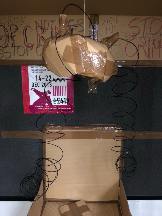
In this essay, I will be exploring a couple of artists and their artwork which was exhibited at The Tate Gallery (Located in Southbank), which related to the theme of ‘descent’ in which we were originally exploring during the first week of rotation week here at Ravensbourne. 

When visiting the gallery, there were various pieces which I thought were very interesting. There were a list however which we had to focus on, and out of the many that were displayed, the exhibition that stood out to me most was, ‘A Travel Without Visual Experience (2008)’. images of everyday life sightseeing within malaysia.

Screen Shot 2018-10-25 at 15.28.14.png

(Pak Sheung Chuen: until 18 November 2018 – Display at Tate Modern | Tate . http://www.tate.org.uk/visit/tate-modern/display/performer-and-participant/pak-sheung-chuen) 

This piece was created by the Artist, Pak Sheung Chuen (1997), a photographer who’s known for working around the everyday urban environment, involving subtler interventions. 

The series of ‘A Travel without Visual Experience’ was based within a dark room with no light, and the only way which viewers where able to see the installations was to use a flashlight from our mobile phones. I thought this was a very effective way which would make the audiences focus on the very little details being portrayed within the images. 

The way that he had taken these photos were having his eyes closed, and wearing dark glasses throughout the 5 days that he was there, capturing images without being able to see through the help of his mother and tour guides to express what he was able to capture, using a simple point and shoot camera. He had quoted ‘’During the trip, I was still doing all the sightseeing and took many photos, but instead of seeing, I only used my body to sense and experience my surroundings’’. (Pak Sheung Chuen: until 18 November 2018 – Display at Tate Modern | Tate . http://www.tate.org.uk/visit/tate-modern/display/performer-and-participant/pak-sheung-chuen) 

I think it’s a way of allowing us to gather the same sense and emotions as he was feeling when taking the photos, unaware of what the photos will look like once it is revealed as he takes them unknowingly of where he is or what it is that he is taking.

My immediate reaction was that it was beautiful, and I was incredibly amazed by how organised, true and authentic the photos were. It definitely showed the cultural identity of those living in the area/country. What I loved most about the pieces were the similarities, and the feeling of being ‘home’ when observing the photos, seeing the props which were used in the photos as well as the sceneries, as I am Vietnamese, and our culture is very familiar to Singaporeans and malaysians. 

One of my favourite pieces which Chuen captures was the photo of a family having a meal together around a red table. It felt like pure love and sweetness, and a sense of a relatable feeling. I feel it is a cultural tradition which has been passed down for generations as it is a sign of respectful mannerism to eat dinner around the table with your family, and this is something which I do everyday. Where as within the western country, it is okay for children to take their food up to their rooms and eat whenever they are hungry. As you can see also, the side dishes are placed in the middle of the table; this is so that everyone around the table is able to grab the food to eat with their ‘rice’, another typical food which all asians eat. Noticing also that they are using chopsticks, which again is something which has been passed down for generations, as kids within the asian culture are taught to use them since a very young age, whilst the Westerns would use cutleries like a fork, spoon and knife. Another final thing to notice is the fact that these people within the image are eating by a bowl whilst people within the Western usually eat using a plate, with one whole serving meal. 

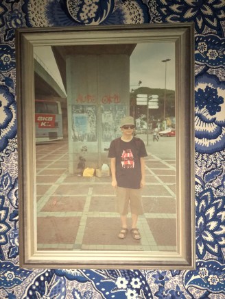
Another favourite of mine from the collection is the photo of what looks like a middle aged man standing randomly to the side of the image wearing sun glasses, and a bucket hat with sandals. What I specially liked about this image was the rawness of it being taken without adjusting the perfect angle or lighting with no filter to it which captures the trueness of what the scenary is. If you look at the sky, you see that it is a light hint of blue with mostly clouds and I like that it isn’t pigmented as if it was edited. 

IMG_9877

In conclusion, the reason why I had chosen Pak Sheung Chuen series of art is because I thought it was one that related to the theme of descent most. It represented the asian culture as a whole well even though he had only visited malaysia. In the majority of the photos which he had taken, it wasn’t just a still image of people standing in it, but to me there was a story behind it, or a reason as to why an object was there within the photo. It links to descent because its a capturing movement of traditional events, objects and lifestyle which people within Asia continue to carry throughout the years of their lifeline in order to pass it onto the younger generation to come. 

GRAPHIC DESIGN FINAL GROUP PROJECT

On our last day of graphics design, we were split up into our four groups (C1, C2, C3 & C4) Whilst two groups were in the class assessing and presenting each others work, the other two groups including my own were set a task to go around the school building and create a structure/ words representing our theme. It was a challenge at first as we did not know how to go about it and where to start, but after a long discussion, and trying to combine everyone’s theme and opinions together, we decided to go with a class mate’s theme of ‘death penalty’ creating a cell with an electric chair and using the materials, cardboard, strings, brown tape and news paper which we collected from around our surroundings.

This was a fun project as it helped us work collaboratively.

LIFT

Life is a short film directed by Marc Isaacs in 2001. He set himself up in a London Tower block’s lift. The video captures the moments between Isaccs and the residences revealing some important things that mattered to them.

Lift was a thought provoking short film. There were a lot of emotions that was conveyed from each of the individuals that came into the lift and encountered the video recorder.

There’s something quite unusually touching about the video in itself, The first few minutes into the video, I felt awkward and didn’t really understand the director’s intentions o what he was trying to portray.. Near the end, I started to realise the messages which were being conveyed deep beneath the words that were being expressed; a lot of hidden emotions.


SOFTWARE TUTORIAL (07.10.2018)

Software tutorial taught us how to us photoshop and illustrator. I was glad that we had a lesson on how to use photoshop even though it’s something I’ve already learnt how to use it – it was a good way to refresh my mind on how to use the software. However, computers weren’t working and I was unable to borrow out a school laptop due to technical issues so I was paired up with a class mate. I didn’t want to slow him down so I used my initiative  and decided to use photoshop on my iPhone which is something I’m very good at.

Our goal was to get a random image from the movie ‘ocean’s 8’ and recreate it into a poster of our own.

The way that I did this edit was adding layers, citing and blending the images together with the red background (first layer) to create the red effect. I used the app ‘mildiv’ instead of illustrator as an alternative as I was working through my mobile.

I enjoyed this because it was something I was confident and comfortable with. The reasoning for making Rhianna the main focus is because she is a celebrity who’s always been talked about, and is considered hugely poplar especially to the younger audiences. more so, she is known as a singer, not an actor therefore you would imagine that the audiences specially her fans (which she has millions of) would be very keen to watch it. It is very obvious that she is known as she only needs to go by her first name like other actors and celebrities.