media production : animation

This was a lesson I found extremely fun. Although it was something which I had not yet learnt throughout my school life, it was fascinating to see the different animations that others were able to create using different artistry and styles such as

Types of styles:

  1. Anime
  2. Disney Cartoon
  3. Gaming

Techniques:

  1. Rota Scoping
  2. CGI
  3. Project mapping

The animation world is an amazing thing, which producers use to target  a diverse group of audience. Today, it is used as a way to entertain both children and adults. In the past, animation was created for children and most famous for this was Disney movies. However, in today’s era animation is now also used as a form of entertainment for adults e.g. South Park, family guy etc.

One of the animations which we watched was produced by a New Zealand producer, Leng Li. In this short animation, his art was very colourful, using different techniques including scratching and painting onto film tape strips.

Another file that we had also watched was ‘mamoon’ by the producer Ben. This video in particular was very simple yet very meaningful and effective. Through this video I had interpreted that the characters my be middle eastern as the mother in the video is wearing a headscarf. The two are of the blue colour family, as you watch the video you realise that the red is taking over the blue and the mother tries to save him. This to me is an illustration of ‘war’. This could be a sensitive topic to most considering it is what’s constantly appearing on the news lately, especially within the middle eastern countries. (https://www.youtube.com/watch?v=HrBAcyLrk1o)

The distinctive language of animation can be surrounded as follows (anyone element (or more) might be intrinsic to an individual approach):

metamorphosis – the ability to facilitate change from one into another without edit.

 Condensation – The maximum degree of suggestion in the minimum of imagery.

 Anthropomophism – The imposition of human traits on animals, objects and environment.

Fabrication – The psychical and material creation of imagery figures and spaces

Penetration – The visualisation of unimaginable psychological/ physical/ technical ‘interiors’.

Symbolic Association – The use of abstract visuals signs and other their related meanings.

Sound Illusion – The completely artificial construction of a soundtrack to support the intrinsic silence of animated forms.

_______________________________________________________________________________________

Before creating an animated cartoon, we were asked to draw a simple outline sketch of 5 things which we thought had an impact on 2018, and in this scenario I drew a an iPhone on the instagram app of the famous internet star, Kylie Jenner. There are many reasons to this, some which includes:

  • This year she was announced as the youngest billionaire
  • She had her first baby with the Star Rapper, Travis Scott
  • She’s consistently launching new products etc within her makeup line

In general, she seems to always be a big topic on social media, not forgetting to mention she is the famous Kardasian’s younger sister.

The second picture which I had drew was an ‘off-white belt’, ad the reason for this is because the brand Off-White has now become a trend, especially the belt which people are using as decorative accessories. You would normally think a belt’s purpose is to help something like your jeans feel more fitted, however in this case people have been wearing it as a new fashion style, some even go far and beyond as wearing it around their legs.

Third, was a picture of a graveyard. This image in specific tells a deep story of the lives which we have lost throughout this year. Around it, I have included a few known names.

Whilst creating the animated little movie, it was definitely a challenge as it was difficult to repetitively draw the same image exactly the same, however I thought of an alternative and that was to trace. However, despite this, it involves a lot of patience in order to draw it as accurate as possible as a mistaken line could take the whole prespective of the animation.

I thought my idea was very interesting however, I found it difficult to portray despite the idea being so clear in my head. This taught me that, even though this task may seem simple, in order for it to work it involves a lot of planning and perfecting.


The story behind a photo

Through media production and photography, I learnt that through one image there is a thousand words that can be spoken. It isn’t always direct but when you carefully address and analysis a photo, you will be able to get a sense of feeling and experience from a person’s facial expression, their body language, colours and the way that they are dressed.

We was set a task to take photos which told a story, and I picked out 3 images of myself which I thought represented me best. The reason why I think chose these images because I like the fact that it kind of captures my real identity; a shy girl, who likes to hide behind her makeup as a confidence booster hence the dramatic makeup with bright red eye shadow. I think the red background beautifully contrasts the colour of my hair as well as my makeup. You also notice that my hair is curly, when in reality it is naturally straight. my facial expression and body langue where my hands are placed on my shoulders also depicts a sense of loneliness, fragile and insecure person who looks very lost.

The first image also kind of shows how I am scared to open myself up to the world. However, the last photo looks a bit more fun. I think this represents the idea of how a shy person could also be very fun and free once you open them up and get to know for they truly are.


LIGHT, TEXTURE AND REFLECTION 

During today’s lesson, we were set a task to play with light, texture and reflection using photography to capture interesting photos. I enjoy taking portraits in specific, therefore I diverted my attention towards mirrored images of my friends. I had also came up with the idea about ‘opposite reflection’, portraying a male of the darker skin completion, against myself, who is of the lighter skin completion to show contrasting tones and textures; in addition I had also took interest in patterns and lighting of my surroundings within the school building, such as grid railings and furniture. 

Before coming into this foundation course, I had learnt very little about photography or how to properly use a camera as I didn’t have that kind of access considering I was always strictly studying ‘fine art’ and the limited resources. To be able to experience a different media; something out of my comfort zone wasn’t only exciting but interesting to see the outcomes of how a bad photo could be seen as something very expressive, interesting and meaningful regardless of whether it was deliberate or not. Although I may not be considering taking photography as part of my career path, it is definitely something that I enjoy doing as a hobby, and from watching a couples of videos on media production about how a camera is used, what colours and tones set specific moods and how it reflects of on the audience was very helpful, giving me a push to better my work quality. 

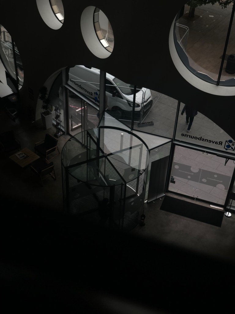
The first task that we was set was to take ‘3 bad photos’, by doing this I played with the lighting on my phone, reducing the brightness to create a dark and unfocused photo, and through this after having a careful look back at it, I realised it looked quite effective. 

The next photo which I had captured was using the filter ‘pano’ on my iPhone X, which involves moving the camera to the right, allowing you to capture an almost 360 degree view of the setting. I deliberately went against the rules and consistently went left and right to create this cut off photo of my friend.

Finally, another darkened photo of constructions outside the window from my School building. Again I achieved this by decreasing the brightness on my camera setting to the lowest possible. 


Autograph ABP Visit

As you walk into the front door, you will immediately notice the range of art pieces of what seems to be, a man of the African descent, dressed in traditional clothing. Traversing through the gallery, you will also notice other pieces of work which again seems to be portraying the African race – which I thought was very fascinating; the reasoning being is because

when visiting galleries, you don’t often see a lot of people of the darker skin complexion exhibited around London, therefore I thought it was a exciting and interesting change to see.

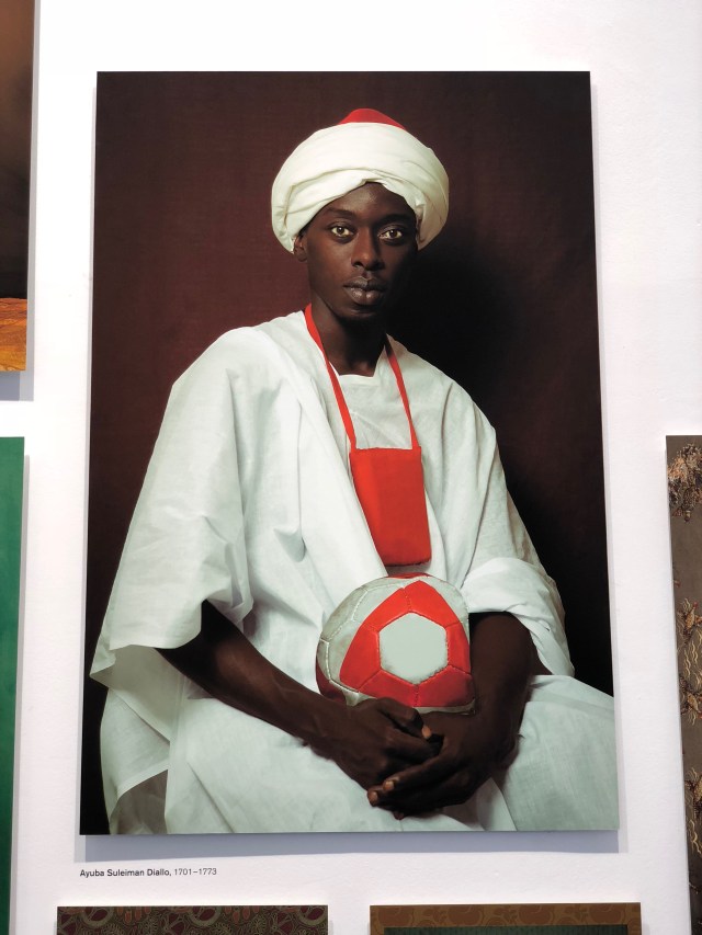
What caught my attention mostly, was the series of the African man dressed in conventional attire, showcasing different stories behind their uniform. From observing the images, my first impression of the art pieces was how black people are no longer neglected and dehumanised, and are considered as an equal in today’s society.  

The contrast between the images of what might possibly be, portraying ‘slavery’;

shows how black people were considered slaves within the 17th century, hence why when you walk through the gallery, on to the left hand side of the wall are pictures of people of the African descent dressed in tradition clothing, alined aside one another following the proper tradition, where as the man on the right seems to be influenced by the western society. 

IMG_7316

(Ayuba Suleiman Diallo, 1701 -1773) born within the muslim family in Senegal, who was a victim of the Atlantic slave trade during the 1731, who was later then bought out of slavery by public subscription. It was a conflict between Islam and slavery; known to be the earliestt understanding of the Wester African culture vs Salvery when Diallo’s memorises were first published in 1734. He is also known to be a pioneering figure in asserting the moral rights and humanity of the black people.


THE PHOTOGRAPHER’S GALLERY (02.09.2018)

These are photos which I have gathered from visiting the gallery ‘The Photographer’s Gallery’. Why I decided to capture these photos in specific; I was given a task to explore around the theme of ‘Descent’. And what does the word ‘descent’ mean? There are many different ways that the word can be interpreted – whether it’s inheritance, physical emotional, spiritual etc.

Photos which I had managed to gather from the gallery is portrayed more towards the physical side.

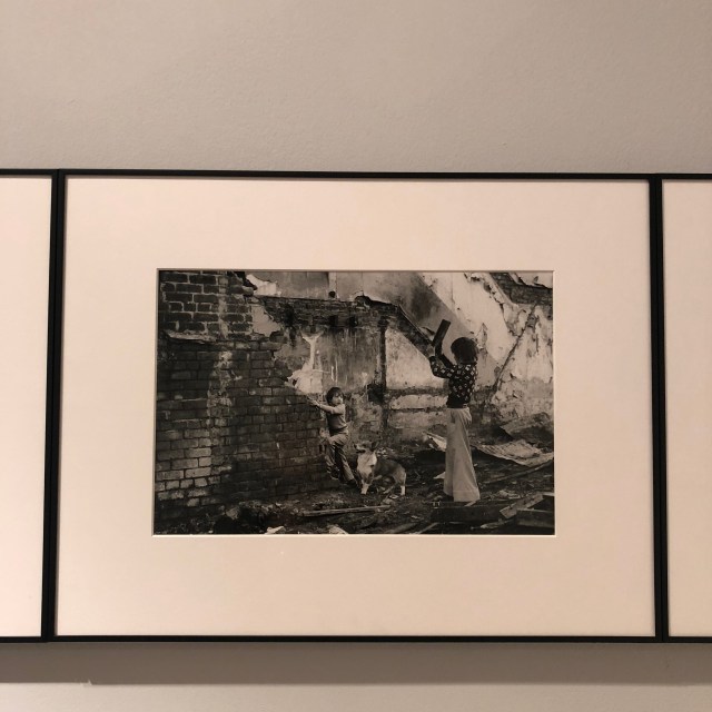
IMG_7124

Elswick Kids (1978)

This photo in specific really depicted the word ‘descent’ as there are collapsed buildings surrounding the area. Instantly, I can see there are various of reasons why the word comes into play. Of course, descent could also mean falling, or descending. The buildings have collapsed and children lives has been changed negatively due to this.

Captured by the artist Elswick Kids, she returned to the North East after studying within Wales. After returning she worked around Elswick area where neighbourhoods were declined and distorted due to the falling of shipbuilding industry. This piece of work was inspired by the children who lived within the area and had to deal with poverty, and lack of opportunity.


Other photos which I had explored was the art work of Alex Prager, where he had created multiple series including, 4:01pm, Sun Valley, 2012 / 1:18pm, Silverlake Drive, 2012/ 3:14pm, Pacific Ocean, 2012 and 3:32pm, Goldwater Canyon; as shown in the figures. my favourite piece was the one depicting people floating on top of the ocean. I loved this one in specific because it gave me inspiration to create my final piece using the idea of ”drowning/sinking”. I found it amusing and very interesting considering it was different to other art pieces which I had seen before. more so, when looking at this picture, it was easy to link, and I found meaning associated with the theme ‘descent’.