Fashion Textiles/Promotion FINAL PIECE

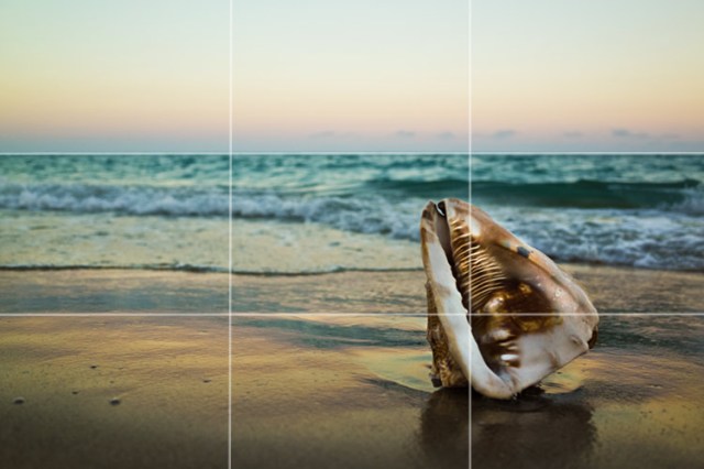
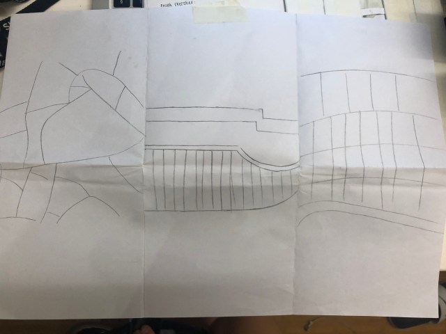
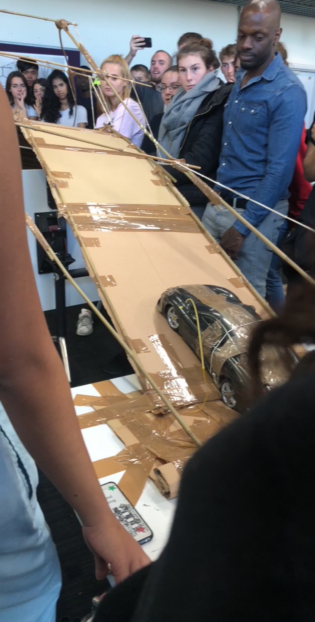
Fashion Textiles final piece which evolved making a final garment was quite tricky to say the least because I used a difficult shape I planned on making a body wear however decided to create a head wear instead as it seemed more appropriate. Furthermore, due to the patterns on my chosen shape taken from a zoomed architectural building image – it seemed more effective as a hat.

As we only had very little time and very little resources, fashion textiles here at Ravensbourne compared to textiles during A-levels has taught me to be more experimental with my dear, and understand that not everything will go as planned however, you are still able to make an outstanding outcome, which sometimes turns out more effective.

We was then given a task to go out as a 3 and take photos related to our theme.

At first I was extremely stuck and confused as to how I could’ve portrayed this, but we used magazines to help us create a vague idea of how we wanted our final photos turn out. For me, I wanted a lot of concentrated headshots, retro look hence the retro white glasses which really complimented m models outfit, and a bright red background which constructing well with the white. I also did bold red eyeshadow on her eyelids to allow her face to stand out further.

UNADJUSTEDNONRAW_thumb_13.jpg

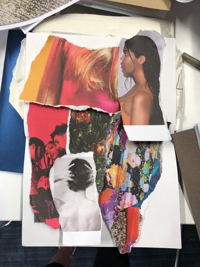
my final outcome for the fashion promotion collage, I tried to keep it as simple as possible therefore stuck to the colour red, white and black as I didn’t want the colour to be too overpowering to the point that the photo became unnoticeable. I enjoyed fashion promotion a lot more as I enjoy fashion promotion a lot more as I enjoy editing and photography. The only unsuccessful thing about this final project which I wished I would’ve changed was my final garment. I was not very happy with it. I think I could’ve done a lot better, and the other downfall was, my powerpoint kept glitching and shutting down therefore I failed to finish it completely.

FINAL DESIGN


3DCP – DAY 3

Day 3 was my favourite day throughout the whole week. We were put into a random team of 5-6 people to create a bridge using the only materials we had including:
  • Brown tape
  • Cardboard
  • Bamboo Sticks
  • Elastic Bands
In the beginning the whole team had an idea of what the bridge should look like, and as a team we decided to incorporate all of our ideas together. Everything didn’t go 100% as expected through the process of making the bridge but because we gathered more ideas along the way, it helped make the bridge become more stable – but the majority of the plan and process went very well.

I believe we worked really well as a team and our final outcomes was somewhat simple but nice. It looked and felt stable. The vain reason for this is because we created a thick layer of bamboo sticks to hold the cardboard from below. We also created of thick layers of cardboard to hold the sticks in place.

Despite this, I believe that with a little more time, we definitely could’ve designed a better bridge with even more stability!

To end the day off, Geoff used his broken electric toy card to test the bridge and see how successful it was; whether the toy was able to cross the bridge successfully or not.

UNADJUSTEDNONRAW_thumb_54

To conclude, the whole process was more or less a success and I enjoyed it a lot!


GRAPHICS DESIGN: DAY 2

Our 2nd task was to practice the letters ‘g’ in different styles, the reasoning for this is due to it being known as the hardest letter to work/change. throughout the day we were also appointed to go around the o2/Greenwich area and search for 26 letters of the alphabet , punctuations and numbers 0-9. Initially you would think that t would be quite an easy task , however I did not want it to be easy. I wanted to push myself and make it a challenge, and be as creative as possible. This task turned out harder than I imagined.

midway throughout the day, unfortunately we were distracted by a bomb threat within the o2 which forced the entire university to evacuate the school facilities for healthy and safety reasons, and was not allowed back on site until another 2-3 hours later. Despite this, along the way, my friends and I kept up a positive attitude and continued with our search for the alphabetical letters. In the end, I did not managed to capture all numbers and punctuations like asked, but I managed to get all 26 letters, creating them to look as diverse as possible.

0.png


3DCP – DAY 2

Day 2, was a very enjoyable lesson consisting of using spaghetti to build a standing structure that could old up a minimum of 3 plastic balls. Before we did this, we did a few experimentations of creating a few sketches on what we plan on creating our structures to look like.

I thought it was going to be pretty easy at first but after starting it, I realised how hard it was to control the glue gun and hold each spaghetti in place; this also made me realise that I should’ve practiced my structure before making it. However, in the end I managed to create a successful structure even though it dd not go as plan, or looked the way that I wanted it to as it was very experimental. I was very inspired by my class mate’s structures, how carefully they constructed their shapes, and how thick I was that it was able to with stand a certain level of weight.


After this, we were tested to use only plain white paper as a material to protect our structure. We had to try out best to keep it safe from the ball that Geoff was going to use to DESTORY our work.. and did he destroy them? He certainly did.

3DCP – DAY 1

On the first day within 3D, we were set a simple task of drawing/writing out all the birthday presents which we have received throughout the years, and this could include anything from restaurants you have visited during the time, to physical objects like a teddy bear or piano.

I tried recalling everything which I have received throughout the many years, showcasing them through doodles and letters. It was a bit challenging as you had to fill up a whole A1 papers much as possible.

After this, we cut the outline of the papers that it was all attached as long as possible and dangles. We then took it around Ravensbourne building and took pictures of it.


LIFE DRAWING/PHOTOGRAPHY

Life Drawing

Life drawing for me was quite an amazing experience. To be frankly honest, I don’t like the idea of life drawn very much simply because I think it’s rather boring just sitting there, composed within a seat for hours, attempting to draw the same person within the same position for a couple mintues – hours. Despite this, considering it being my first time, I thought it was very interesting and it definitely helped me to improve the pace that I draw when observing something in a short amount of time/moving. I allow me to be free and taught me to trust my instincts and believe in my own outcomes. They were definitely not perfect at all, or anywhere near to the figurative image of our model, but it was definitely somewhat effective.


I wasn’t too impressed with the final outcomes of my drawing. We used black charcoal and coloured oil pastels to draw our subject. The reason I was not happy with my outcome was because I did not press hard enough therefore you can’t really see it. I think it would’ve been more effective if I had pressed harder for more detail and emphasis on certain areas.

PHOTOGRAPHY

Photography has always been something within my interest but before this short class, I managed to learn the very basics of how a camera functions, and how to use it in a short amount of time. We were taught how to appropriately convey a portrait photo using light and shadows, the shutter speed etc for certain effects and under the right lighting.

The class in general was very fun and fascinating as I understood the importance of spacing, light and functions of a camera to capture the perfect photo.


GRAPHICS DESIGN: DAY 3/ FINAL PIECE.

Our final task was to research a couple of typography artists and fonts which we found interesting and would co-operate well within our theme. my initial theme was the idea of gender equality, and how I felt that females aren’t treated as fairly as men; and even til today’s current standards, men are still seen more superior and more capable – which is very sexist however, I decided to change my mind and focus on something more optically important which I believe has an effect on not just certain regions but countries all around the world e.g. Syria.

I thought this was an interesting topic because it’s constantly appearing on the news as I believe a lot of people would agree. War is not only affecting lives of children, adults and families, but it’s also dividing us as a society due to different beliefs; leaving homes and the environment around us destroyed.

Now that we had our theme, we were ask to experiment and play with our fonts between A-Z. I widths mainly by using ‘dynamites’, ‘nuclear bombs’ and bombs as inspiration relating to the theme quite obviously.

After experimenting with different designs, we had o come up with a slogan, I came up with a few however in the end I decided on ‘Children are dying. Homes destroyed. Humanity dying. Society dying. The world is dying. NO more WAR!’.

There are definitely things which I could’ve done e.g. coming up with a better and shorter slogan which audiences’ would be bothered to read.


Graphics Design: DAY 1

On the first day, we were introduced to graphics design, showing us what the course had to offer if we had chosen to take this pathway. The course in itself seemed quite relaxing. Our first task for the week was to use the letter ‘C’ as our main focus/attraction, this was specifically because we were ‘GROUP C’. This challenged a lot of us within our group to make outstanding versions of the letter C to beat the other groups which had already previously did the task. through this, we were expected to find materials which not only portrayed the obvious (outline of C), but emotions and meaning behind it; to convey different emotions and meanings. This could’ve included the way that it was presented, shaped, coloured etc.

The first ‘C’ that I had created was made from the material of cardboard. Unfortunately, we did not have enough time to complete the task as everyone

UNADJUSTEDNONRAW_thumb_5d

was using the equipment .e.g glue guns, therefore, my creativity was limited. I purposely ripped out areas of the letter further after carving the letter into it so that it could appear distressed, and to me, this represented ‘anger’.

I purposely also left the sides of the cardboard messy to complete it.

The second letter ‘C’ was a cotton material wrapped around in thick layers of masking tape. I then also proceeded to wrap some strings/think ropes

UNADJUSTEDNONRAW_thumb_5c
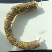
around the letter as I wanted it to stand out a little more, as well as bring more life to a plain and boring object, whilst still managing to keep the original meaning behind the letter itself.  So this C to me was representing the word ‘shy’; the reason being is because I wanted it represent myself.. As if I am the material hiding itself under a thick layer of clothing, make-up and emotions, and it’s almost impossible to open me up.

Lastly, the last letter C for me portrayed… every word which was listed on the board. The reason for this is because the letter C made out of play dough was multicoloured, and was very randomly mixed, this conveys a mixture of emotions; almost UNADJUSTEDNONRAW_thumb_5b
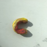
like having mood swings or prehaps, each colour represents an individual mood hence why there’s no specific emotion conveyed. I believe it’s simple, yet very expressive and strong.


media production: rule of 3

Video 1. Shot composition basics for film and television

  • Visual elements which are arranged on screen are known to be just as essential as what is being shown/said. This is also known as ‘visual story telling’, which is what initially should be capturing the audience’s attention as well as the psychology of character.

Whiles watching this video, I took down some notes on some of the rules which involves filmatrography.

RULES OF THIRD: This involves splitting your screen into 9 (3×3) even sections, then placing your subjects within the intersection/ along the lines as I helps to create more interest and energy. (An example is shown before in figure 1)

Figure 1

Figure 1

2. Head Room: Known as the distance between the subject’s head and the top of the frame


Fashion Promotion/Textiles: Day 2

Although it was only our second day being introduced to the course of fashion, we were challenged to create a final garments in preparation for our final day of the week. Using our inspired shapes, I again, created a geometric hat using my research of architecture as inspiration.

But before this, we were asked to bring in some home materials which we could find lying around our house which were suitable to our research, so for this I bought in a couple of black and white plastic bags, cardboard and foil. I did not know what to expect at first, but then realised were expected to experiment with our resources to create something random for a friend to wear, and in this nerve wrecking situation, I quickly constructed together a neck piece which had funky shapes around it.

Considering we had only 5 minutes to make a garment out of the resources we brought in, I decided to use foil as it was the easiest to control and bend, where as if I was to use clingfilm, the material would just bend as it is not heavy enough to stay within a position, cardboard involves a lot of cutting and ripping in order to create a shape, as well as having to use tape etc to stick pieces together. Foil on the other hand, can easily be constructed together.


Introduction to Fashion Promotion/Textiles

Fashion is a subject which has always been within my interest. I studied it as one of my A-level options, however everything was very fine art based. Having the opportunity to study it here at Ravensbourne was exciting and very different as the level of work, and the environment that you work in is very experimental and more fun. It teaches you to go with the flow and be creative using your surroundings within the moment whiles using simple materials such as tape, rather than having to be so organised; sometimes messy is better than planned and polished work.

On the first day where we was introduced to this one week rotation within Fashion, we were asked to bring rolls of tape, and do research on 3 different themes of our choice, and I picked; Culture, Architecture, and Colours. The use of the research was to help us grasp ideas and create a final piece.

Using the material that we had, we were asked to find 3 images, and zoom in close into the photo and draw a section of it. (The 3 photos are the bottom are the photos which I used as reference).

Figure 2

We then drew it out on an A3 of paper, splitting it into 3 sections, sketching the images as largely scaled as possible. Here is my example

img_8471.jpg

Using the drawn examples as a guide, we created half a shoe using masking tape to create a trainer. And again, here is my example created below: As you can see, I have used the example of figure 1 as an inspiration to create this design. I was very happy with the outcome and impressed with myself to have been able to create something so random to look quite stylist, and I’m sure it would look better with some colours and extra detail to it.

Our next task involved created 3D samples out of plain white paper in order to create as many garmented looks as possible. For this task, I decided to make a head piece using figure 3 as an inspiration this time. These are some of the random styles which I had come up with at the time:


@ The Tate

Whilst studying the theme of ‘descent’ during the first week, we visited the modern Tate museum to explore the many arts that was exhibited there to see whether it had any correlation to our theme or not, and how it would inspire us to develop our work further.

There were many interesting pieces of art displayed when working my way up and down different levels of the gallery however, there was one in specific which really stood out to me. At first the meaning behind the photo was unclear, it was hard to interpret but after reading the description on the side, it helped me to translate it into my own denotation which related back to the theme descent.

Time 1970 (David Lamelas, 1946)

Time 1970 (David Lamelas, 1946) ”This photograph documents the first performance of Time. A group of people stand in a line. The first person tells the time to the next person. They ‘receive’ the time and ‘hold on to it’ before announcing it to the next participant. The last person announces it ‘to the world’ in the language of their choice. This images shows ‘time’ being performed in Les Arcs in the French Alps.


After reading it, it allowed me to translate it to the idea of how, genetics and inheritance is passed down from one generation to another. Passing on their traditional down to their descent. The first person who ‘tells the time to the next person” is interpreted as the ‘mother’ who passes down her heir line to her next, hence why they ‘receive’ it and ‘hold on to it’ before passing it down to the next person. The last person announces it ‘to the world’, initially meaning that who is alive today, they have a piece of DNA from the first person standing. Within today’s society a lot of people are now a mixture of culture and nationality, hence why the last person who announces it to the world, does it in ‘the language of their choice’, sort of showcasing how their from a multi cultural background, therefore they are able to speak more than one language.